
Moon Palace
Moon Palace Restaurant To build a culturally rooted yet globally appealing Cantonese brand that attracts a younger, urban audience. Type of Work Brand Strategy & Visual Identity Design Client Moon Palace Year 2023 Website www.moon-palace.ca Located in the heart of downtown Toronto, Moon Palace (粤园) is a modern Cantonese seafood restaurant that brings authentic Guangdong culinary culture to mainstream Canadian audiences. CGICA provided comprehensive brand strategy and visual identity design services, helping the brand resonate with a diverse demographic—from CBC families to young professionals and international students—by redefining what it means to enjoy classic Cantonese cuisine in a stylish, approachable, and high-value setting. The project covered positioning, brand story, visual concept, and bilingual applications to ensure both cultural authenticity and commercial appeal. A modern Cantonese seafood restaurant that is approachable, high-value, and fits seamlessly into urban lifestyles. The authentic Cantonese culture, presented in a fresh way. 粤地道,越新鲜 —— Bringing out the soul of Cantonese cuisine through modern experience design. A refined typographic logo paired with a serene moon symbol, balancing tradition and modernity. Warm lighting, clean lines, and cultural accents—creating a comfortable, inclusive atmosphere for both social dining and business occasions. Previous ProjectNext Project Explore Other Projects All Posts Restaurant Luna Chinese Banquets Yu Seafood – UI/UX Design The Captain’s Boil – Menu Design
Magic Noodle – Illustration

Magic Noodle – Illustration Food & Beverage To visualize the cultural roots of Chinese noodle-making and enhance brand storytelling through art. Type of Work Illustration Client Magic Noodle Year 2013 Website www.magicnoodle.cn To bring the story of Chinese hand-pulled noodles to life, CGICA crafted a visual storytelling system for Magic Noodle (大槐树) rooted in cultural history and brand identity. By retelling the journey from ancient noodle-making traditions to the brand’s own origin, we built a narrative that resonates across generations. Two illustration styles — vector graphics using the brand palette, and traditional ink-brush paintings — were created to serve different contexts: marketing communications and cultural storytelling within the physical space. Dual illustration styles: vector art for branding, ink painting for ambience Cultural storytelling: from Han Dynasty to modern-day Magic Noodle Integration of heritage and modern aesthetics Previous ProjectNext Project Explore Other Projects All Posts Advertising & Media Art & Culture Articles Articles-cn Auto Mobile Beauty & Spa Construction & Reno Corporate E-Commerce Education Electronic Products Energy Entertainment Event & Show Fashion Financial & Investment Food & Beverage Global Enterprises Grocery & Retail Health & Medication Home & Deco Immigration & Student Service Legal Services Living Service Organization Pets Photo/Video Professional Real Estate Restaurant Sports & Fitness Supply Chain Uncategorized Web & Technology The Captain’s Boil – Illustration Heart Sushi – Illustration
Cocky Spicy Fried Chicken
Cocky Spicy Fried Chicken Food & Beverage Create a rebellious, spice-forward chicken brand that stands out in a saturated fried chicken market. Type of Work Brand Strategy & Identity Design Client Cocky Spicy Fried Chicken Year 2023 Website cockyspicyfriedchicken.com Cocky Spicy Fried Chicken is not your average chicken joint—it’s an attitude, a heatwave, and a culinary dare all in one. With bold flavour, unapologetic spice levels, and a mascot that struts with swagger, Cocky reinvents Korean spicy fried chicken for a younger, bolder generation. The brand fuses Korean culinary roots with North American pop culture edge, delivering a fried chicken experience that’s as visual as it is flavourful. The design language is punchy, irreverent, and heat-driven—every box, napkin, and neon sign says: “If you can’t handle the spice, stay out of the coop.” Cocky is the spicy fried chicken brand for heat lovers who crave bold flavours and bolder personality. Bring fire and flair to the fried chicken scene with a fearless voice and unforgettable spice. “Spice with Swagger.” — because great chicken doesn’t just burn, it brags. Previous ProjectNext Project Explore Other Projects All Posts Food & Beverage Dan Café Kobi Korean Street Food Samurai Burgers
Dan Café
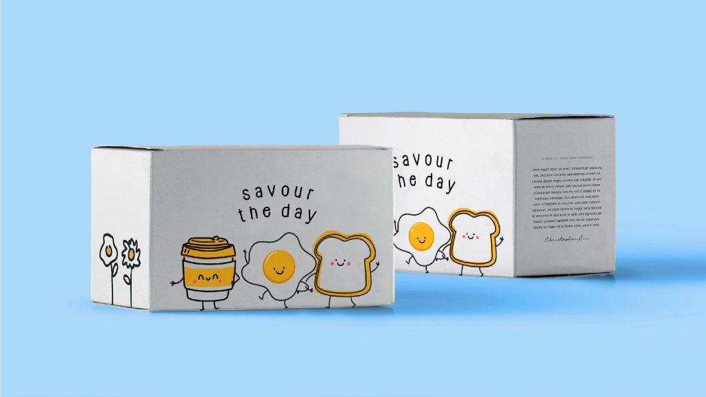
Dan Café Food & Beverage Craft a café brand that reflects Daan Go’s creative culinary DNA, while standing alone as a stylish, all-day brunch destination. Type of Work Identity Design Client Dan Café Year 2023 Website Dan Café is the latest concept from the creative mind behind Toronto’s beloved Daan Go Cake Lab. Building on a strong fan base, Dan Café reimagines all-day brunch with playful flavours, artistic plating, and a space designed to delight. Whether it’s a mid-morning latte, an indulgent French toast stack, or a late-afternoon eggs benny, every dish is a fusion of fun and finesse. The brand identity mirrors the founder’s signature whimsy with elevated café aesthetics—clean yet colourful, elegant yet full of joy. It’s not just a meal—it’s a mood, crafted to be as Instagrammable as it is delicious. Dan Café is an artful brunch destination for modern food lovers who crave comfort, creativity, and a touch of sweetness all day long. From cake to café, turn every dish into a canvas—bringing playful creativity into the brunch world. “Whimsy, Served Daily.” — where everyday meals meet extraordinary imagination. Previous ProjectNext Project Explore Other Projects All Posts Food & Beverage Cocky Spicy Fried Chicken Kobi Korean Street Food Samurai Burgers
Kobi Korean Street Food
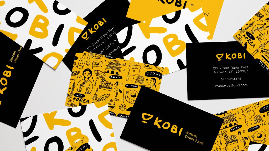
Kobi Korean Street Food Food & Beverage Build a dynamic, street-style brand identity that introduces Korean corn dogs as a must-try snack to a North American audience. Type of Work Brand Strategy & Identity Design Client Kobi Korean Street Food Year 2023 Website Kobi Korean Street Food is a playful, bold, and flavour-packed brand centred around Korea’s most iconic street snack—the Korean corn dog. From cheese-filled to crispy-coated creations, Kobi captures the lively spirit of Seoul’s night markets and makes it accessible to global urban eaters. The brand combines fun, youth-oriented energy with irresistible crunch and flavour, making each bite a crave-worthy experience. Through expressive typography, vibrant colours, and cheeky character illustrations, Kobi brings the sizzling energy of Korean street food culture to life—right in your hand. Kobi is your go-to destination for authentic Korean street food, reimagined for today’s fast-moving, flavour-hungry youth. To turn Korean corn dogs into a pop-culture icon through a brand that’s as snackable as its products. “Crunch. Stretch. Repeat.” — a playful invitation to indulge in the satisfying texture, cheese pulls, and joyful flavour of Kobi. Previous ProjectNext Project Explore Other Projects All Posts Food & Beverage Cocky Spicy Fried Chicken Dan Café Samurai Burgers
Samurai Burgers
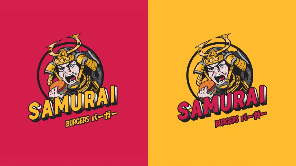
Samurai Burgers Food & Beverage Create a culturally resonant and visually exciting burger brand that channels Japanese spirit through flavour, personality, and graphic storytelling. Type of Work Brand Strategy & Identity Design Client Samurai Burgers Year 2024 Website Samurai Burgers is a Japanese-inspired fast casual burger brand that blends bold flavours with bold visuals. Rooted in the symbolic power of the “Samurai,” the name is both culturally resonant and universally recognisable—suggesting strength, honour, and most of all, satisfaction. Each burger is crafted to be generous and fulfilling—enough to satisfy even a warrior’s appetite. Visually, the brand embraces Japanese manga aesthetics, using dynamic comic-style illustrations to speak to a younger, anime-loving audience. From brand story to in-store experience, Samurai Burgers delivers more than just food—it serves up a full-blown adventure. Samurai Burgers is a manga-inspired Japanese burger brand that offers bold, satisfying meals designed to fuel modern-day warriors. To deliver a feast fit for a Samurai—through rich flavour, hearty portions, and immersive cultural storytelling. “Burgers of Honour. Bites of Glory.” — a comic-charged call to dine like a warrior, and leave no bite behind. Previous ProjectNext Project Explore Other Projects All Posts Restaurant MOGO Chicken Pokéble 渔美人 – 海鲜私享 (Seafood Princess)
MOGO Chicken
MOGO Chicken Restaurant Create a distinct and expressive identity for a Korean-style fried chicken brand that captures its spicy soul and playful, street-smart personality. Type of Work Brand Strategy & Identity Design Client MOGO Chicken Year 2023 Website MOGO Chicken is a bold and energetic Korean fried chicken brand that brings the spirit of Seoul’s street food scene to North America. Rooted in the Korean phrase “Mogo!”—meaning “Eat up!”—the brand evokes warmth, appetite, and attitude. Specializing in Korean spicy flavours, crispy textures, and crave-worthy sauces, MOGO Chicken offers a fresh take on comfort food with a kick. Through vibrant visual identity, playful tone, and a modern brand experience, we helped MOGO stand out as a fun, flavour-forward fried chicken destination where every bite tells you to live a little louder and eat a little more. MOGO Chicken is a Korean fried chicken brand that delivers big spice, big crunch, and even bigger personality—made for those who live (and eat) with boldness. To turn every meal into a spicy, satisfying celebration of appetite, culture, and fun. “Eat Up. Fire On.” — a rally cry to go bold, go spicy, and go all in on flavour. Previous ProjectNext Project Explore Other Projects All Posts Restaurant Pokéble 渔美人 – 海鲜私享 (Seafood Princess) Shanxi Noodles (老山西刀削面)
Pokéble
Pokéble Restaurant Build a brand that embodies the freshness, diversity, and playfulness of poké culture while establishing a strong market identity. Type of Work Brand Strategy & Identity Design Client Pokéble Year 2023 Website Pokéble is a fresh and vibrant poké bowl brand that celebrates the joy of variety, health, and creativity in every bite. With a playful tone and an inclusive spirit, the brand encourages customers to build their own flavour journeys—one bowl at a time. From sustainably sourced fish to crisp vegetables and tangy sauces, Pokéble delivers a colourful harmony of taste and wellness. Through the slogan “A Bowl of Wonder,” we positioned Pokéble as more than just a meal—it’s an everyday celebration of personal taste, healthy living, and positive energy, served in a bowl. Pokéble is a fast-casual brand offering customizable, wholesome poké bowls crafted with freshness, variety, and joyful creativity. To make every bowl a canvas of health, flavour, and personality—empowering customers to eat well, live well, and feel wonderful. “A Bowl of Wonder” — where every combination tells your story, mixing colours, cultures, and ingredients into one magical experience. Previous ProjectNext Project Explore Other Projects All Posts Restaurant 渔美人 – 海鲜私享 (Seafood Princess) Shanxi Noodles (老山西刀削面) Omiwol K-BBQ
Crush Social Eatery
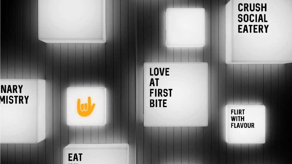
Crush Social Eatery Restaurant Develop a brand identity that highlights Crush Social Eatery’s role as Waterloo’s premier destination for great food and social gatherings. Type of Work Branding Design Client Crush Social Eatery Year 2023 Website crushsocialeatery.com Crush Social Eatery is poised to become Waterloo’s new favourite destination for good times and great food. With a vibrant and welcoming atmosphere, Crush Social Eatery offers a diverse menu that caters to all tastes, making it the perfect spot for social gatherings, casual dining, and special occasions. Our commitment to quality ingredients and exceptional service ensures that every visit is memorable, whether you’re enjoying a meal with friends, family, or colleagues. Crush Social Eatery is Waterloo’s go-to spot for enjoying good times and great food in a vibrant and welcoming atmosphere. Create a dining experience that combines the traditional essence of Japanese sukiyaki with modern culinary excellence, focusing on quality, authenticity, and a welcoming atmosphere. Design a dynamic and modern visual identity that reflects Crush Social Eatery’s commitment to quality, community, and a memorable dining experience. Previous ProjectNext Project Explore Other Projects All Posts Restaurant Shinta Moolan Noodles 68°C Stone & Grill
Moolan Noodles
Moolan Noodles Restaurant Develop a brand identity that reflects Moolan Noodles’ dedication to preserving a century-old culinary heritage while delivering high-quality, authentic beef noodles. Type of Work Branding Design Client Moolan Noodles Year 2023 Website moolan.ca Moolan Noodles takes pride in offering a culinary experience steeped in a century-old heritage. Our signature beef noodles are more than just a dish; they are a testament to a rich tradition passed down through generations. From pasture to plate, each step in our process reflects meticulous craftsmanship and a deep respect for tradition. By bringing this timeless cuisine overseas, Moolan Noodles allows every customer to savour classic flavours refined over a hundred years, blending authenticity with a touch of modernity. Moolan Noodles offers a culinary journey through time, presenting century-old beef noodles crafted with top-grade ingredients and traditional methods. Preserve and share a century-old culinary heritage through a brand that emphasizes quality, craftsmanship, and authentic flavours. Create an elegant and timeless visual identity that honours Moolan Noodles’ rich heritage and commitment to delivering an authentic, high-quality dining experience. Previous ProjectNext Project Explore Other Projects All Posts Restaurant 68°C Stone & Grill OX Club Wagyu Suki 喜和牛