KidsPick

KidsPick initial mobile app UI/UX design — portfolio image 1
Type of WorkLogo / Initial Mobile App UI/UX Design

ClientKidsPick

Year2026

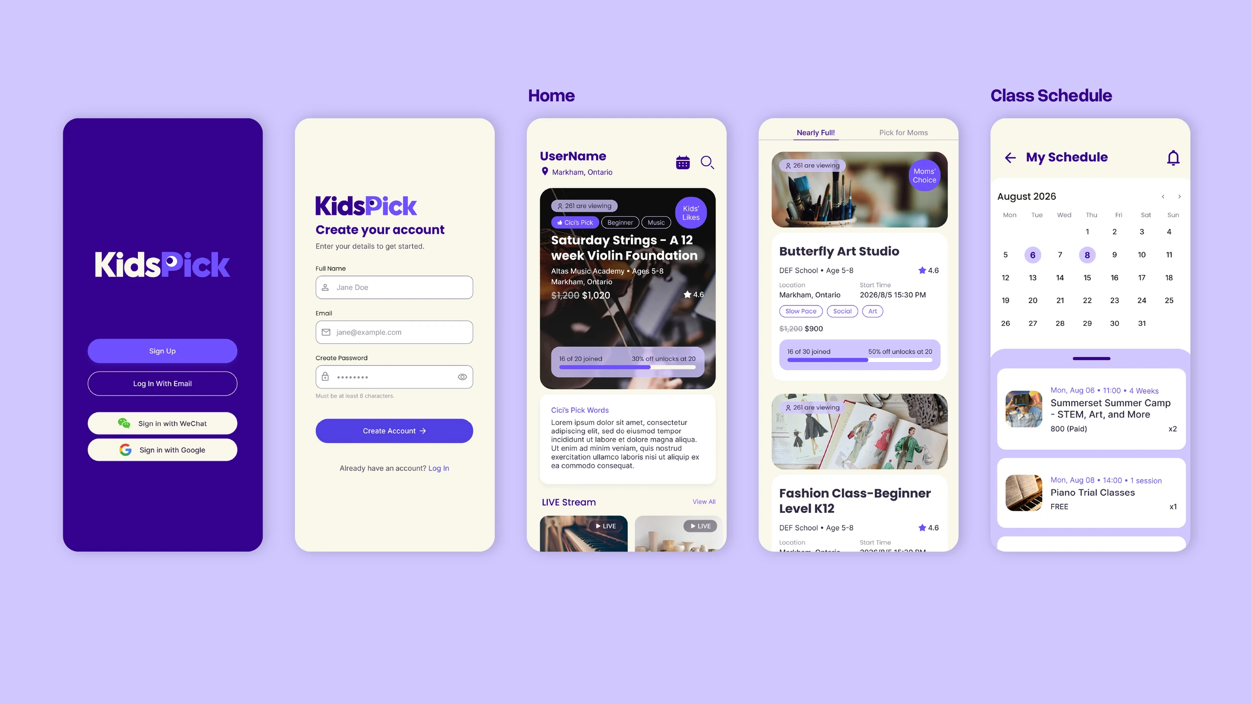
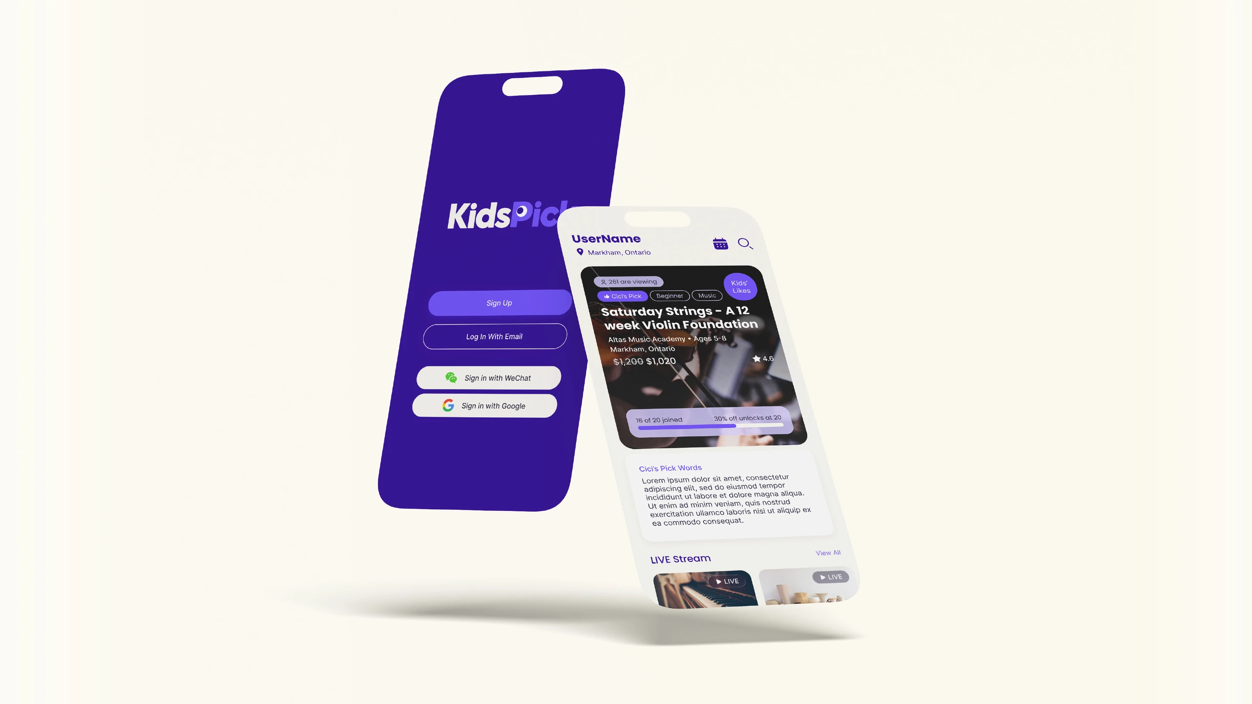
KidsPick is a family-focused education platform that brings together quality children’s classes, extracurricular activities, and summer camps through a group-buying model. By combining carefully selected educational opportunities with the benefits of group purchasing, the platform helps parents discover valuable learning experiences at more accessible prices. CGICA designed the brand logo and initial mobile app UI/UX, creating an intuitive and engaging digital experience that makes exploring courses, connecting with educational providers, and accessing group-buying opportunities simple and convenient.

KidsPick initial mobile app UI/UX design — portfolio image 2
KidsPick initial mobile app UI/UX design — portfolio image 3

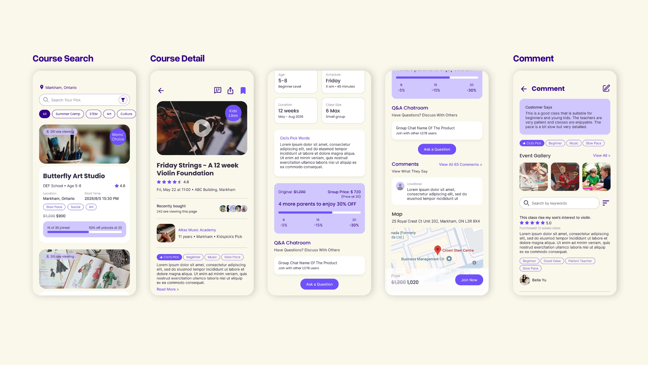
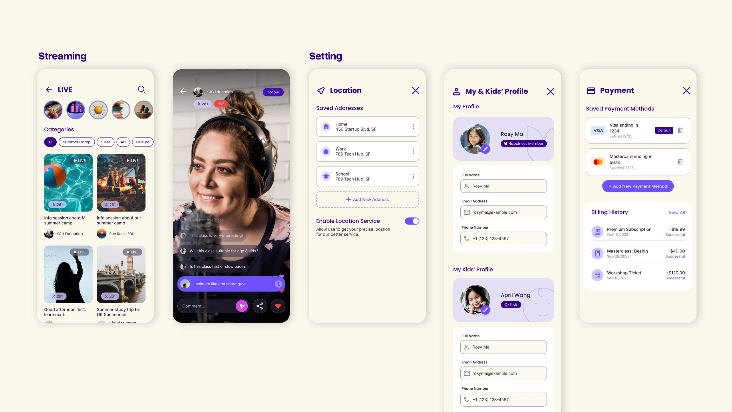
The UI/UX design focuses on creating a clear and engaging experience for parents navigating a wide range of educational opportunities. Through thoughtful information hierarchy, organized content layouts, and intuitive navigation, the interface simplifies how users explore activities and access relevant information. Each design element is carefully considered to support a smooth browsing experience, making the platform approachable and easy to navigate.

KidsPick initial mobile app UI/UX design — portfolio image 4
KidsPick initial mobile app UI/UX design — portfolio image 5

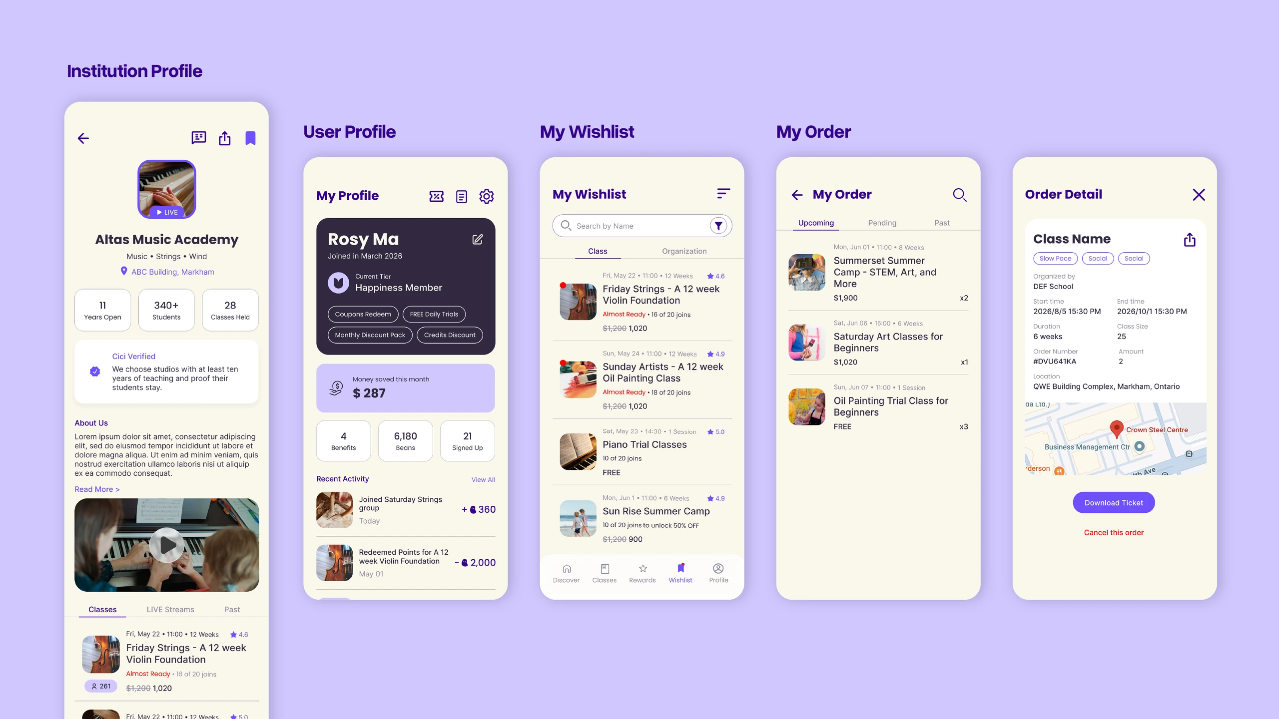
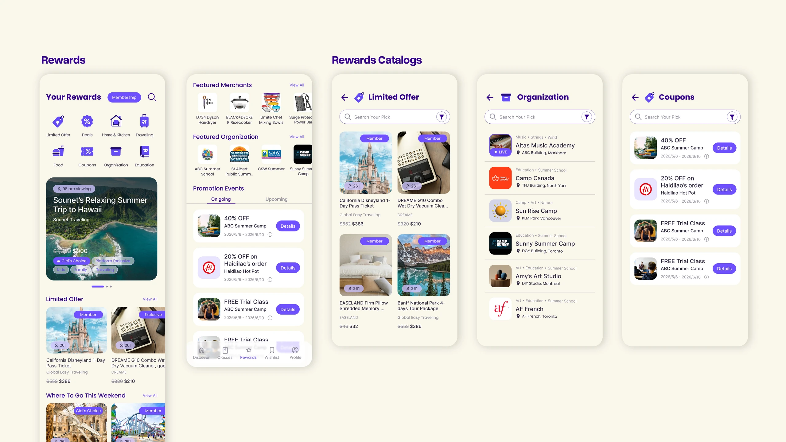
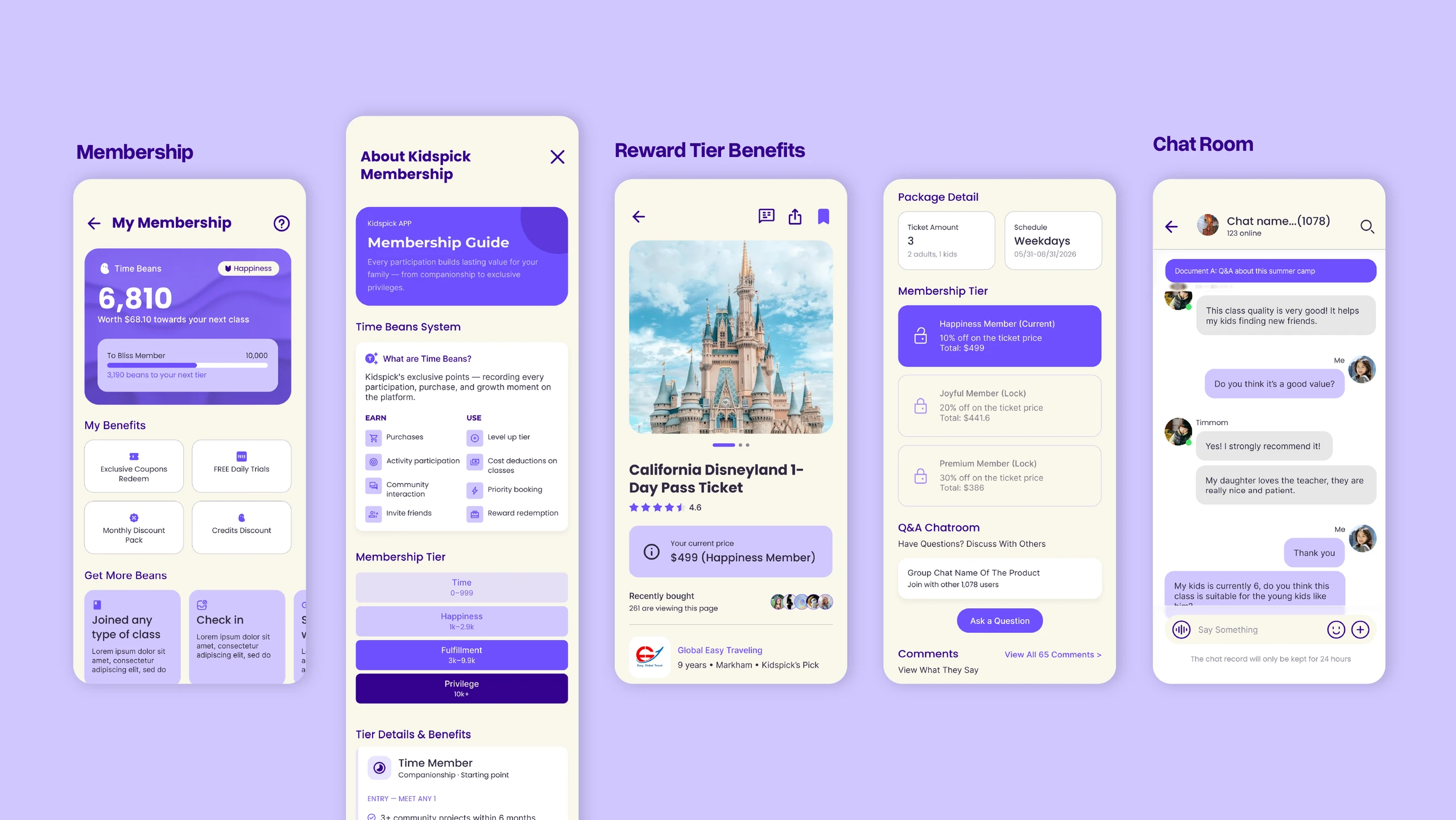
Beyond course discovery, KidsPick makes quality educational opportunities more accessible through its group-buying model, allowing families to enjoy better prices on children’s classes and activities. Membership benefits and community features further enhance the experience, encouraging parents to connect with educational providers and other families. CGICA designed a flexible and consistent interface that supports these experiences, creating a cohesive user journey that encourages participation, interaction, and long-term engagement.

KidsPick initial mobile app UI/UX design — portfolio image 6

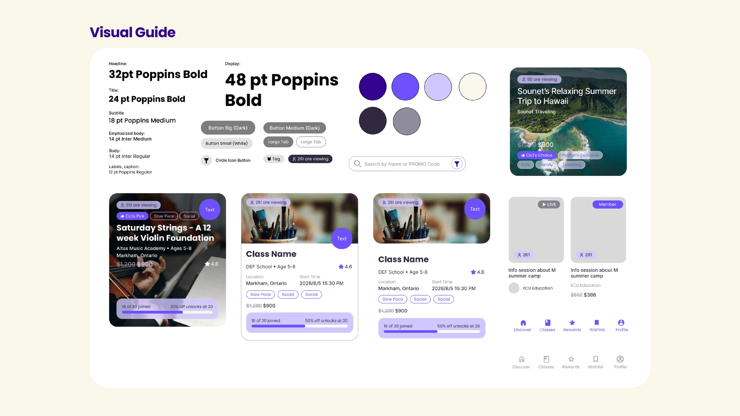
KidsPick’s visual identity combines a vibrant purple palette with soft lavender accents and warm neutral backgrounds, creating a playful yet structured interface. Rounded cards, clean typography, and subtle shadows establish a friendly visual language, while consistent buttons, icons, and layout components support clarity across different screens. The combination of Poppins and Inter typography reinforces a modern, approachable aesthetic, resulting in a cohesive mobile UI design system that balances personality with practical usability.

KidsPick initial mobile app UI/UX design — portfolio image 7
KidsPick initial mobile app UI/UX design — portfolio image 8
Previous Project

Explore Other Projects